

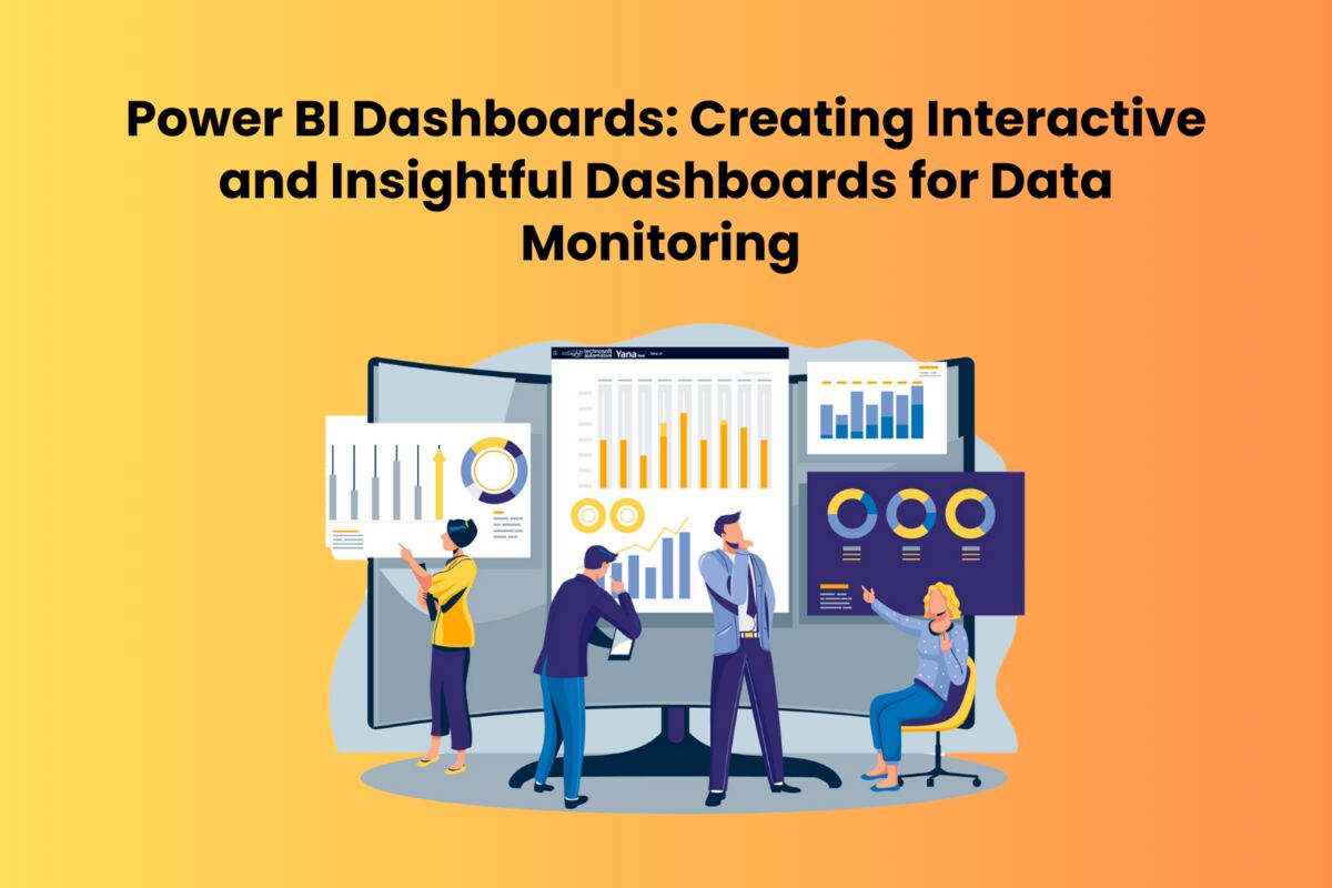
In the age of decision-making based on facts, the capacity to visually monitor, analyze, and interpret data is invaluable for businesses of all sizes. Microsoft Power BI, a leading business analytics tool, has emerged as a vital solution for creating interactive and insightful dashboards. This blog explores the art and science of developing effective dashboards using Power BI, offering guidance for those undertaking Microsoft Power BI Training and answering the fundamental question, “What is Power BI?”
Table of Contents
Introduction to Power BI
Power BI is a group of software services, applications, and connectors that combine to create interactive, visually engaging, and cohesive insights from disparate data sources. Power BI makes it simple to connect to your data sources, visualize (or find) what’s essential, and share that with anybody, regardless of whether your data is contained in a straightforward Microsoft Excel worksheet or a collection of cloud-based and on-premises hybrid data warehouses. You want.
Importance of Power BI Dashboards
Power BI dashboards are single-page, often called canvas, collections of visuals that tell a story. The ability to create comprehensive dashboards is a crucial skill developed in Microsoft Power BI Training. These dashboards are not only about presenting data but also about translating it into a narrative that drives action. They provide a 360-degree view of business metrics and KPIs, allowing for real-time data monitoring and decision-making.
Creating Interactive and Insightful Dashboards
1. Understand Your Audience
Before you dive into creating a dashboard, it’s crucial to understand the needs and expectations of your audience. Who will be using the dashboard? What decisions do they need to make? Answering these questions will guide your design and ensure that the dashboard is tailored to its users.
2. Select the Right Visuals
Power BI offers a wide range of visualization options, from simple bar charts and line graphs to complex matrixes and custom visuals. The key to creating an effective dashboard is selecting the right visuals that best represent your data and make it easy for users to understand the story behind the numbers.
3. Design for Usability
An insightful dashboard is not just about displaying data; it’s about making it accessible. This involves thoughtful layout and design choices that enhance readability and usability. Ensure your dashboard is clear, use consistent design elements, and group related information together.
4. Make it Interactive
One of the strengths of Power BI is its interactive capabilities. By incorporating slicers, drill-throughs, and other interactive elements, you can create a dashboard that allows users to explore the data themselves. This interactivity empowers users to dig deeper into the metrics that matter most to them.
5. Keep it Updated
The value of a dashboard lies in its ability to provide up-to-date information. Leverage Power BI’s ability to connect to various data sources in real time to ensure that your dashboard always reflects the latest data.
6. Educate Your Users
Finally, ensure that the users of the dashboard understand how to interpret the data and use the dashboard’s interactive features. This may involve training sessions, user manuals, or embedded instructions within the dashboard itself.
Conclusion
Power BI dashboards are powerful tools for data monitoring and decision-making. By following best practices in design, visualization, and interactivity, you can create dashboards that not only look impressive but provide deep insights and drive action. Whether you’re just starting with Microsoft Power BI Training or looking to refine your skills, the journey to mastering Power BI dashboards is a rewarding one that empowers you to bring data to life in compelling new ways.
Remember, the goal of any Power BI dashboard is not just to present data but to tell a story that resonates with your audience and enables informed decisions. Start exploring the possibilities today and unlock the full potential of your data with Power BI.
Read also: Siemens Q2100 2P 100A Circuit Breaker